
PBA Player Radar
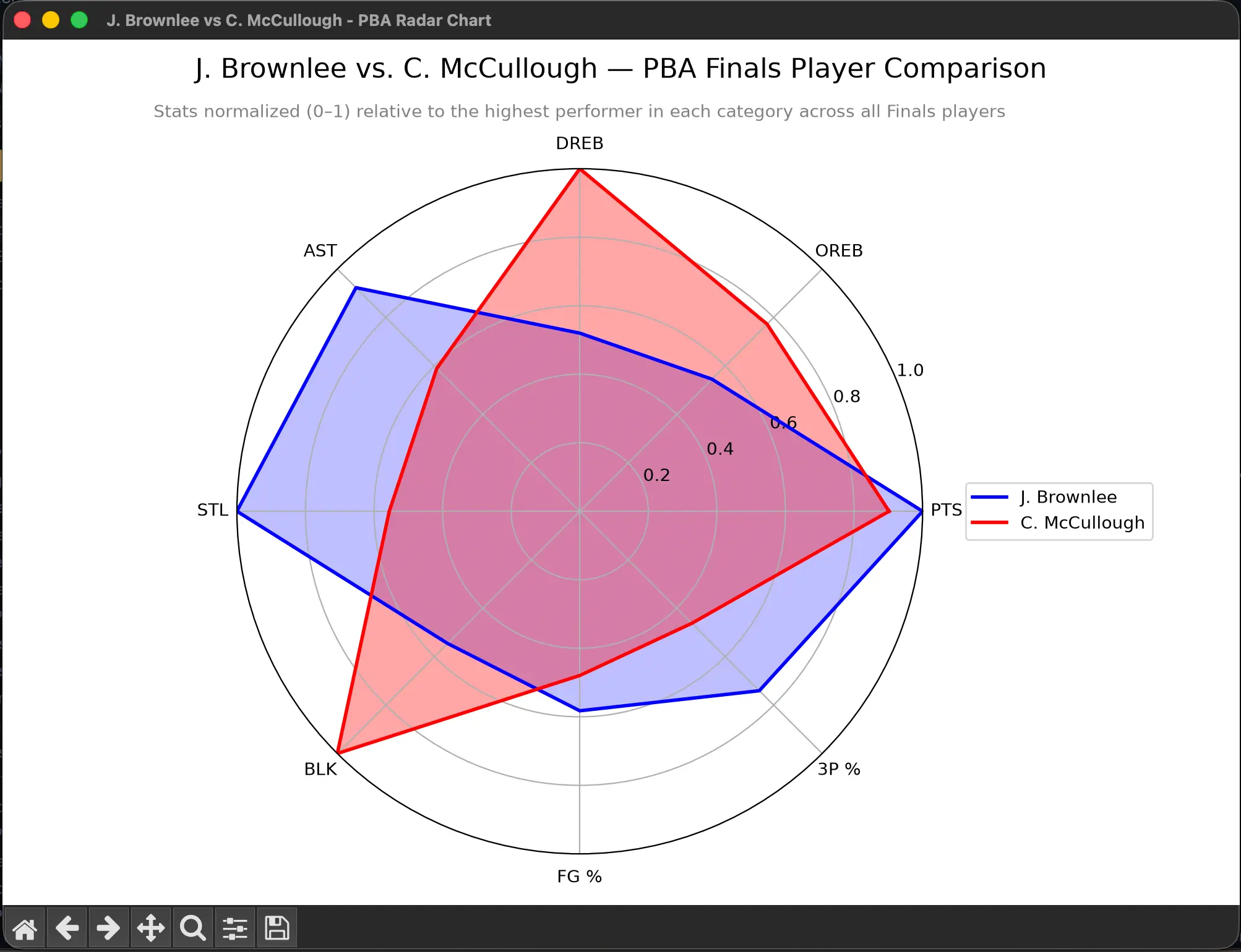
A data viz exercise built while learning pandas + matplotlib for a Data Viz class. It takes a small hand-assembled PBA Finals box score dataset, cleans it — dropping unused columns, removing header/separator rows that leaked into the data, fixing an inconsistent MINS time format, and averaging each player's stats across however many games they appeared in — then normalizes 8 key stats (PTS, OREB, DREB, AST, STL, BLK, FG%, 3P%) on a 0–1 scale relative to the best performer league-wide, not just the two players being compared. This keeps the chart honest: a mediocre finals player shows up as genuinely small even against another mediocre player, instead of being artificially inflated by a two-player comparison. Prompts you to pick two players from a numbered list and renders an overlapping radar chart comparing them.
Built with
- Python
- pandas
- NumPy
- matplotlib